04 — Mark
the icon system
The church icon and illustrated set keep their original three-color palette. They're the one place green lives. In the UI, everything else is navy and gold.
Navy and gold. That's the system. Green lives only inside the illustrated icons — it's heritage, not UI. Everything else runs on two colors and white.
Navy ground, white type, gold accent. Confident. Used for hero sections, headers, key moments.
Gold ground, navy type. Warm, energetic. Used for CTAs, highlights, secondary panels.
Vicky Black brings the personality — heavy, hand-drawn, unmistakable. Plus Jakarta Sans brings the precision — labels, data, the grid. Inter brings the calm — body text that gets out of the way.
Every composition follows the same stack: mono on top (time, place, category), Vicky Black in the middle (the headline), Inter underneath (the explanation). This never changes.
60+ winemakers. Workshops. Oyster bar. Food court. Mini market. One ticket, full access from 13.00 to 22.00.
The church icon and illustrated set keep their original three-color palette. They're the one place green lives. In the UI, everything else is navy and gold.
The hand-drawn weight of Vicky Black is what separates this brand from every clean-sans wine event. It's heavy, imperfect, and unmistakable. Don't fight it — use it big.
Plus Jakarta Sans structures everything Vicky doesn't. Dates, labels, navigation, metadata. It's the skeleton. Uppercase, tracked, small. Never at display size.
Gold marks the payoff word in a headline, the CTA bar, the accent that pulls focus. Maximum one per composition. If two things are gold, neither is special.
The illustrated icons keep their three-color DNA — navy, gold, green. But in the UI, typography, and layout: green does not exist. Two colors only.
Every composition: mono on top (context), Vicky in the middle (headline), Inter underneath (explanation). This hierarchy never breaks. It's the system.
natural wine festival a'dam
all day oysters and paired wines
ticket sales have started
salut.
We are pleased to announce...
Curated biodynamic offerings
An unmissable experience
Join our exclusive community
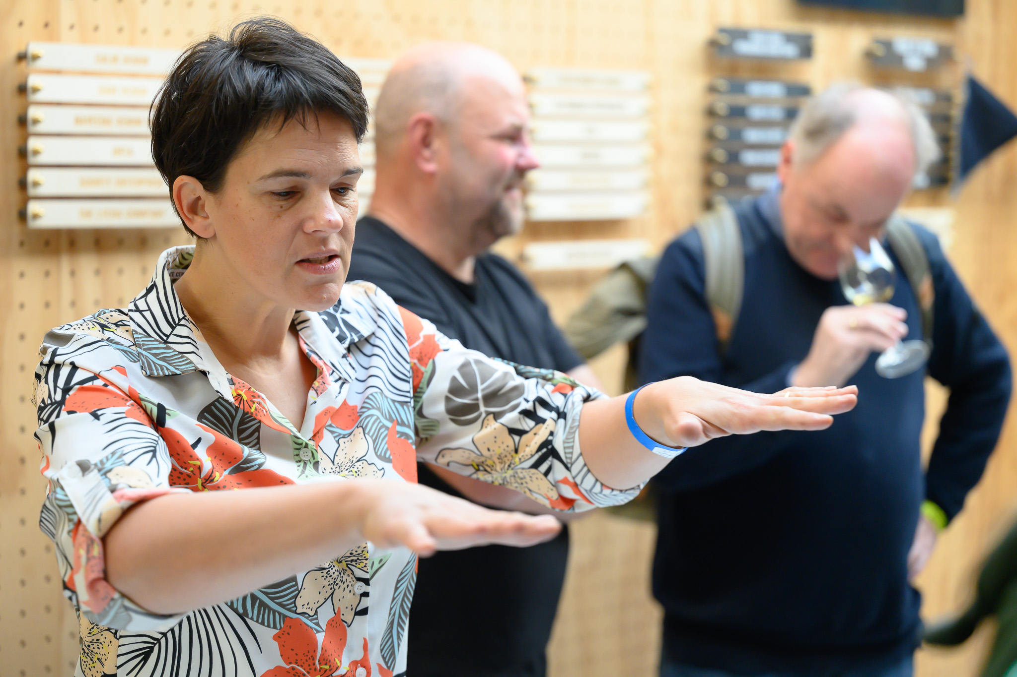
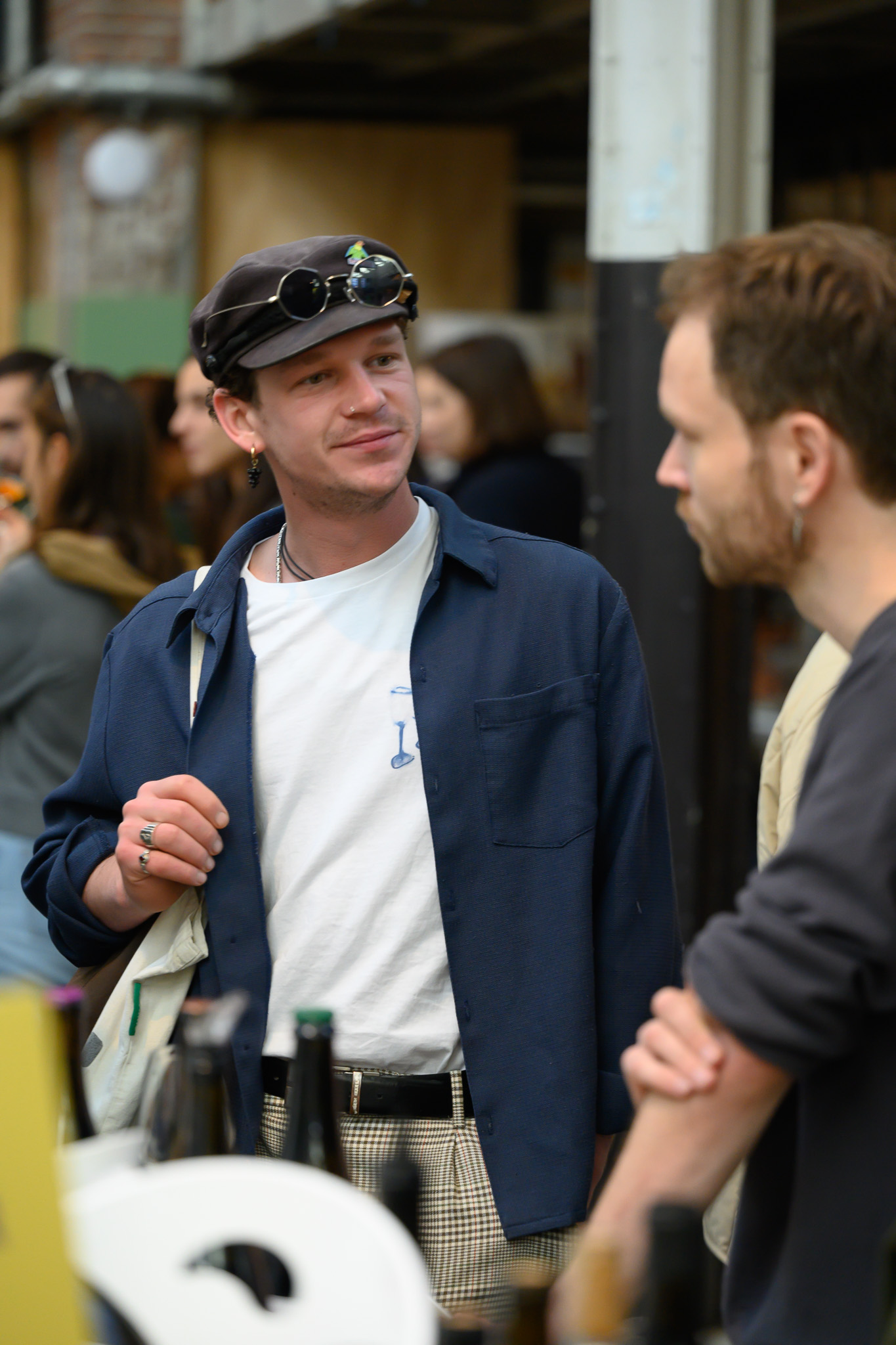
Documentary photography at full saturation. The warmth of the photos balances the structural precision of the typography. Text never floats on images — always on solid navy or gold bars.